I recently learned about flex-box and have been doing some research into it. Hopefully I'll write up a “All about flexbox” post, but for now I want to go through a hands on example of using flexbox in the wild.
What are we working on?
I want to convert the menu of this site to use flexbox.
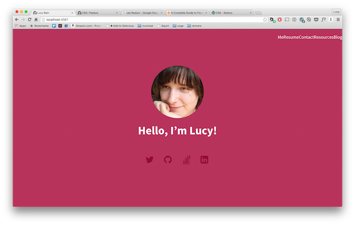
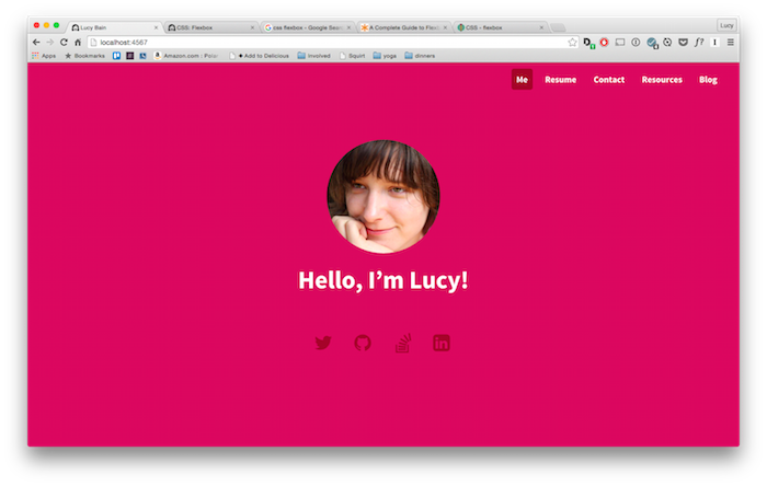
What does it look like now?
Right now I support three cases:
Large (desktop)

Medium (tablet) - this looks almost the same but the fonts are slightly smaller.

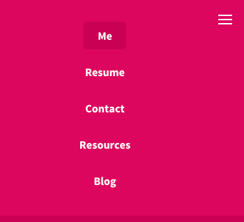
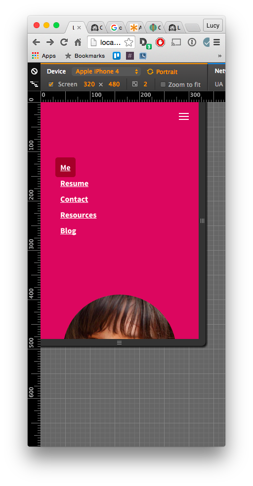
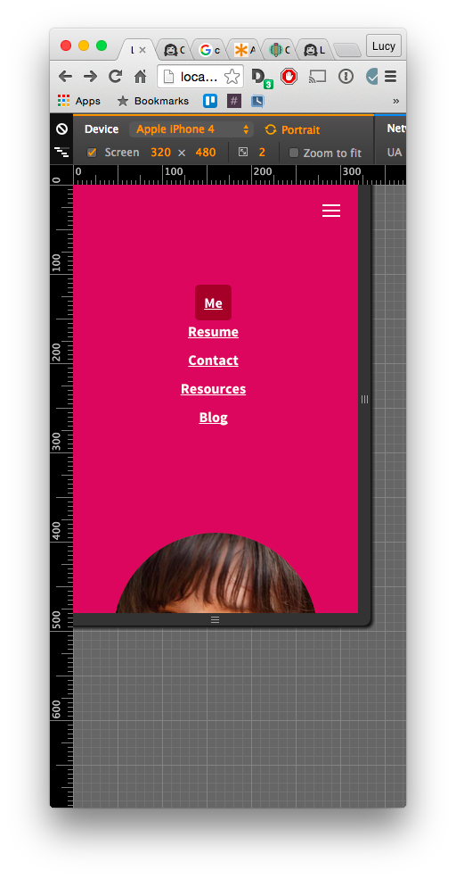
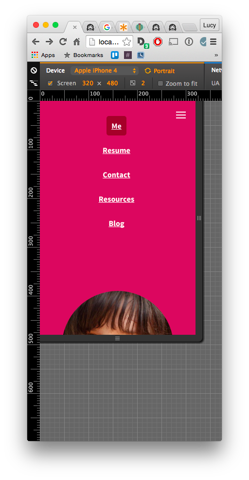
Small (phone)
Ok, let’s make it flexible.
Step 1: remove most of the styling
I went through and removed most of the styling. I kept some things I knew I wanted, but most of it went.

Step 2: add flexbox
I added display: flex to the containing element. It kinda worked, but looked funny because I’d removed the rest of the styling.

Step 3: layout within the flexbox
Next I added how I wanted the content to flex within the flexbox by adding justify-content: flex-end. This meant all the <li>s got squished to the right.
I played around with a few options for justify-content, particularly space-between. While that would better show off flexbox’s capabilities, I decided I didn’t actually want my nav bar all that flexible. Having too much space between the items looks quite strange - especially true on larger monitors. I probably should have thought of this before I started converting my nav bar to use flexbox, but oh well. For learning!
Step 4: add styling back in
Most of my previous styles were still required. I'd hoped I could remove some lines, but it doesn’t seem to be the case.
Step 5: mobile - vertical display
Yes, yes, mobile first and all that. I just wanted to get things working, ok?
The display: flex I added previously was applied to the mobile, so I didn't need to add that again.
But I want the mobile navigation to go vertically, so I changed the flex-direction from row (the default) to flex-direction: column.
Woot! Getting pretty close!
Step 6: mobile - center align
Next up was to center the <li>s across the screen. So I used align-items: center to get all my ducks in a row.
Step 7: mobile - spacing
Finally the spacing around the <li>s was a bit weird so I used justify-content: space-around to display them evening within the nav dropdown's space.
Done!
After all that it was quite a small change with no change to the user experience. But I did learn more about flexbox, so I’ve got that going for me!